Redesigning and boosting engagement on the Studio Soren website

Overview
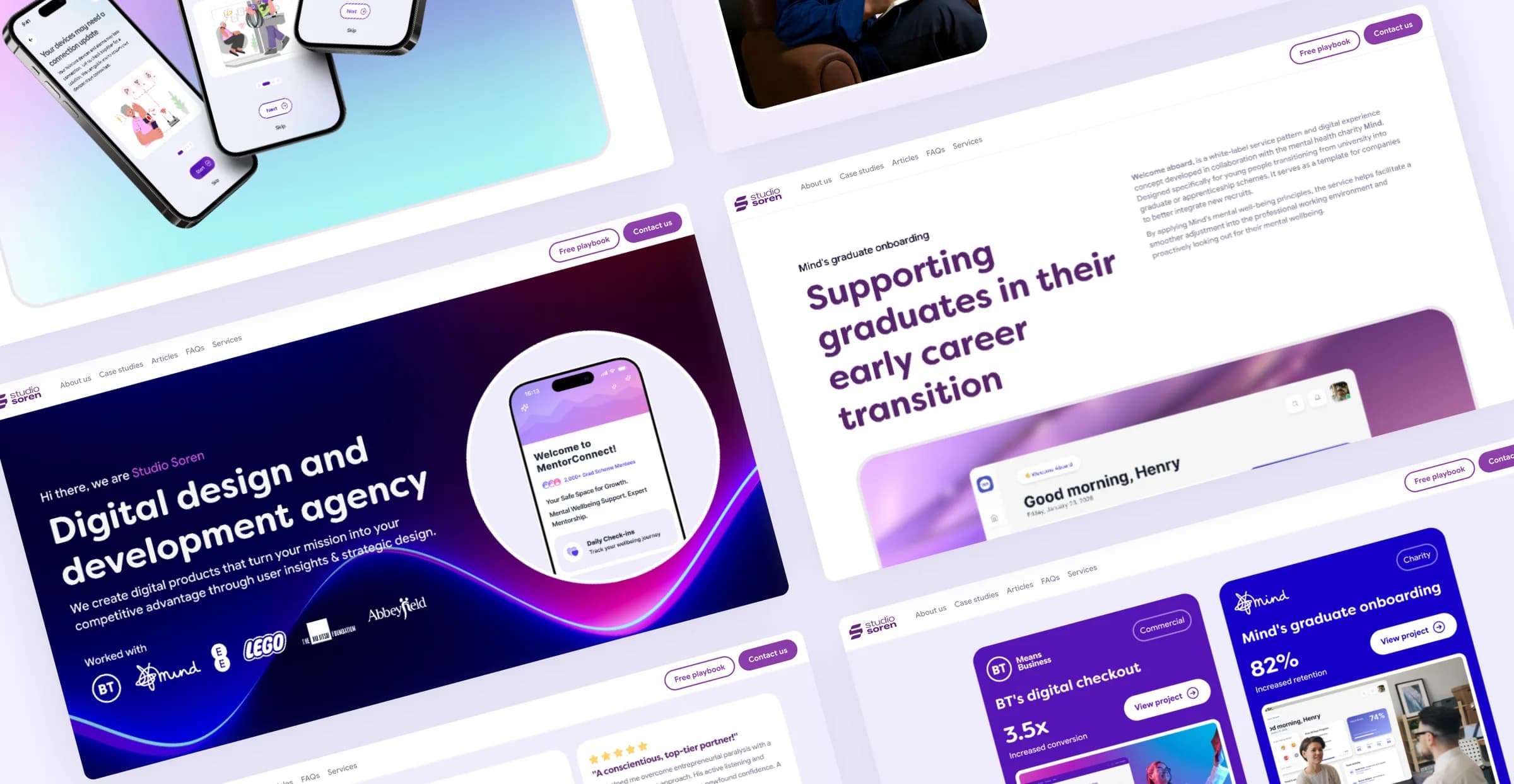
While working at Studio Soren as Principal Product Designer, I led the complete design overhaul and strategic direction of their core website, using analytics, behavioural insights, and UX best practices to improve engagement, strengthen storytelling, and increase leads.
The result was a more refined and conversion-focused experience that significantly boosted user interaction and average session duration.
- My role
- Principal Product Designer
- Core team
- 4 people
- Prin. Product Designer
- Product Designer
- UX Content Writer
- Founder
- Methods
- Product Design
- User Analytics & Data
- Framer Development
- Tools
- Figma
- Framer
- Miro
Results
boost in engagement with key content
increase in new leads and several conversions
boost in avg. session duration to 10min 48s
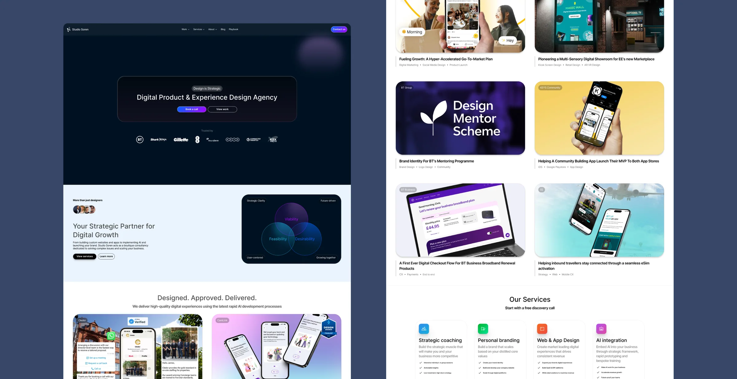
The existing product
Studio Soren’s existing Framer website no longer reflected the quality of the studio’s work, creating an opportunity to improve both the user experience and its effectiveness as a business tool.
Establishing the page hierarchy
Before exploring visual design, I mapped out a proposed page structure to ensure the content hierarchy supported both user needs, business goals and storytelling.
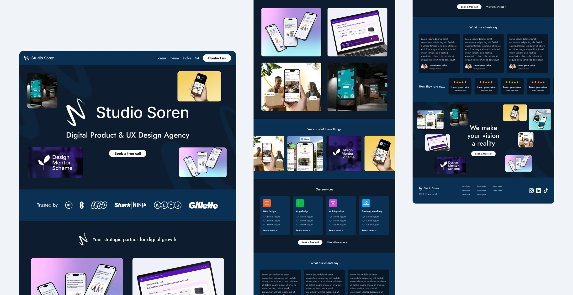
Aligning on direction
During a review session with the founder, we aligned on the proposed structure and discussed the future direction of the brand.
We also agreed to place greater emphasis on project outcomes and client success stories to strengthen credibility and drive conversion.

Analysing real-world use
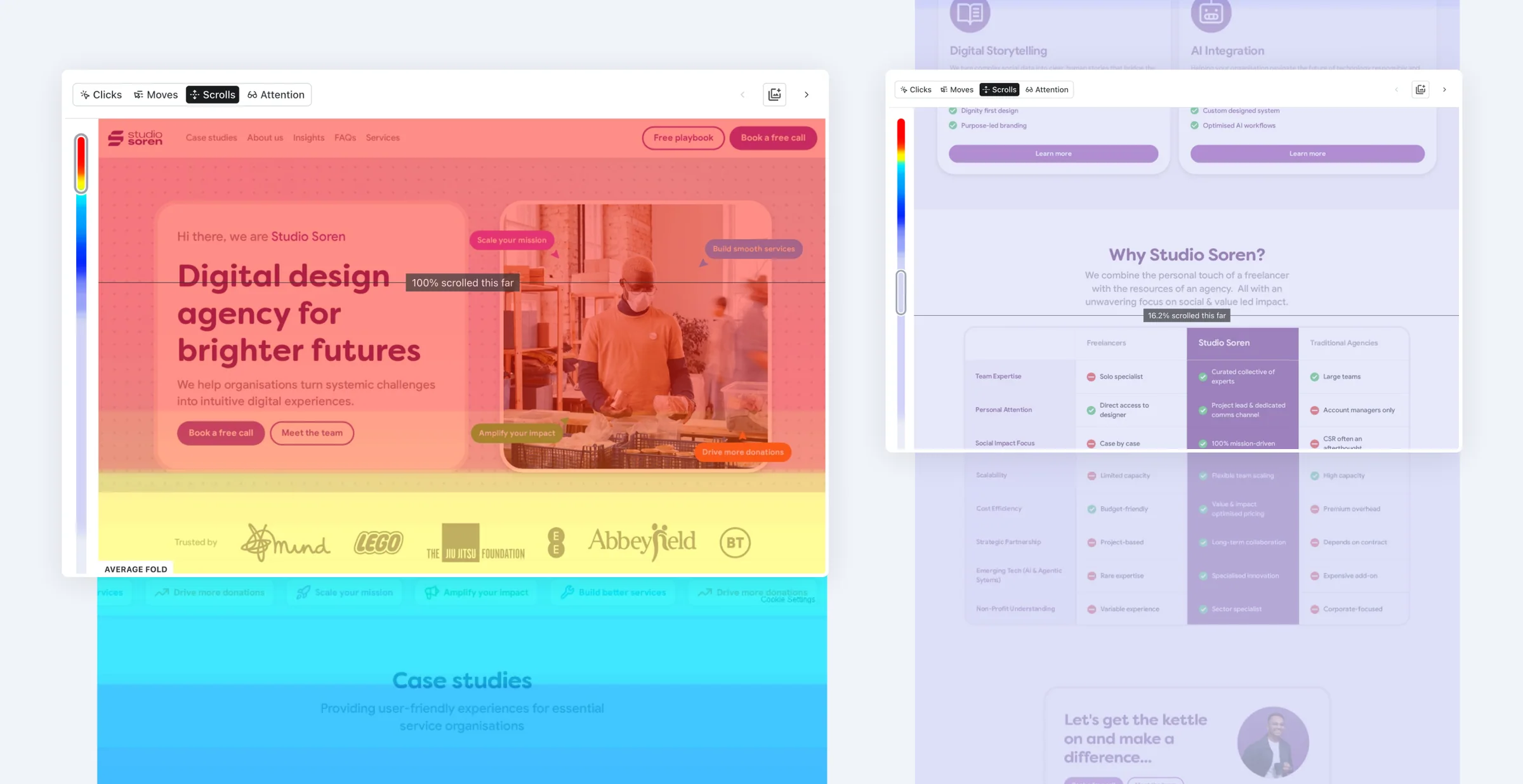
Once the redesigned site was live, I integrated Contentsquare to better understand how visitors were engaging with the experience.
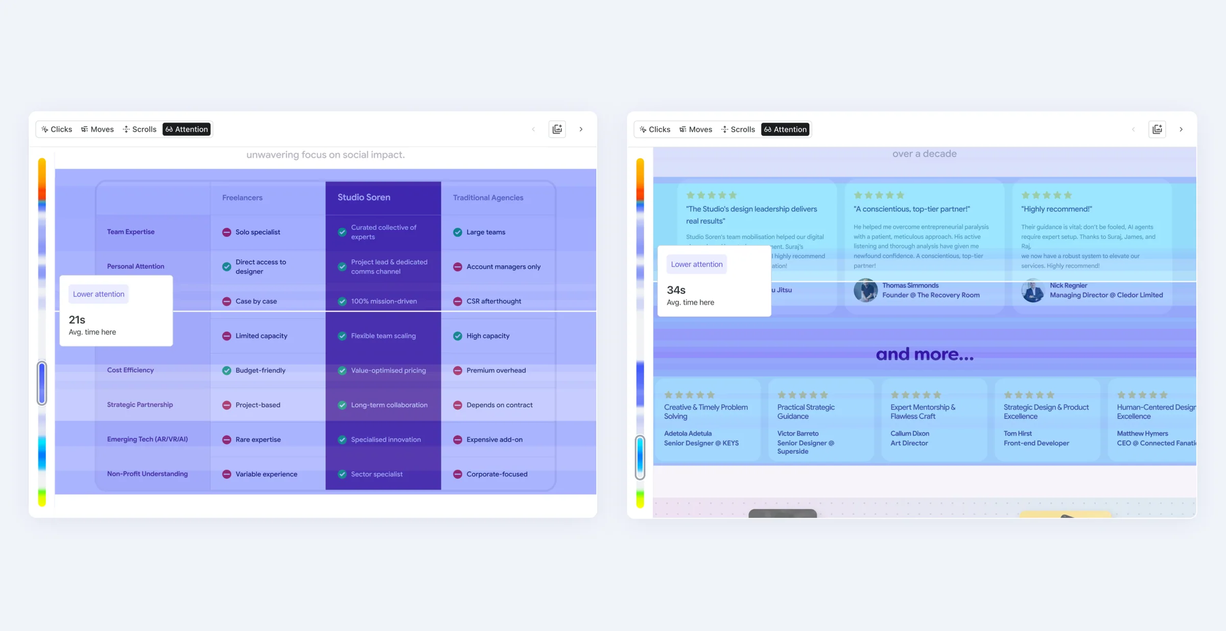
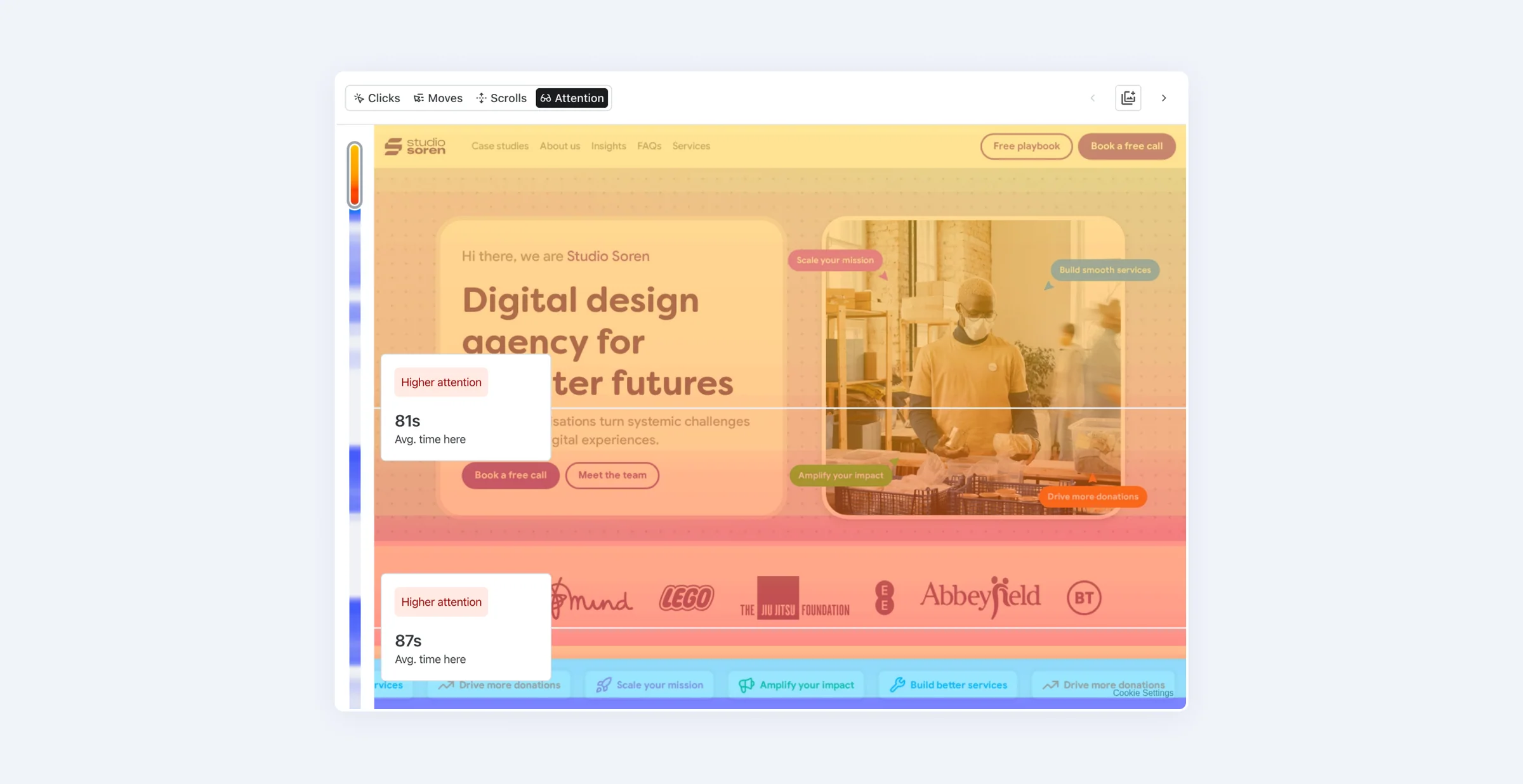
After gathering sufficient traffic, I analysed scroll behaviour, click patterns, attention maps, and drop-off points to identify opportunities for optimisation.
What grabbed attention?
Despite overall drop-off, three credibility signals attracted the most attention on the page from our users:
- The comparison between Studio Soren and other options.
- The reviews of Studio Soren by clients.
- The big brands logo's near the top of the page.
Applying the findings
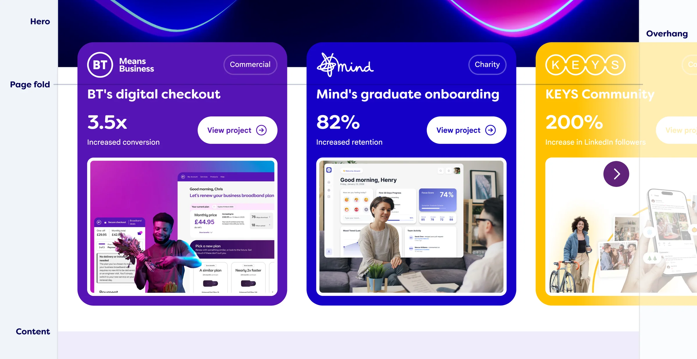
Based on the behavioural data, I prioritised two key changes to reduce friction and surface high-value content earlier in the experience:
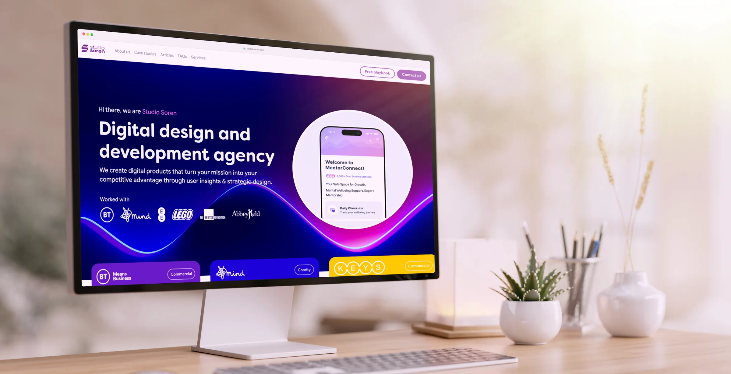
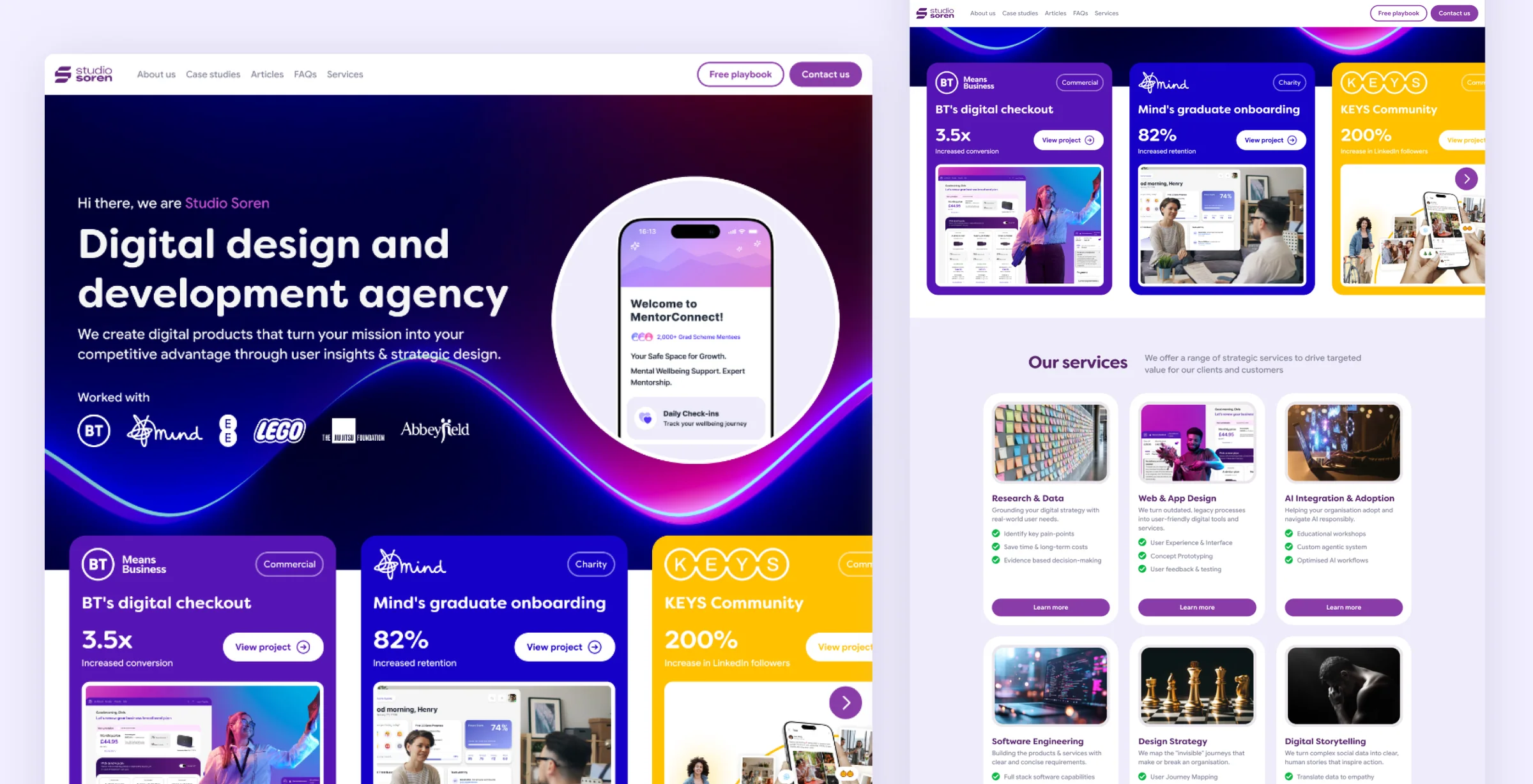
- Lean into big brand logo use, enhance their power with brands colours, and then overhang brand cards just over the fold to make them more visible.
- Reduced the vertical footprint of case study content to improve scanability and minimise unnecessary scrolling.
Redesigning the hero
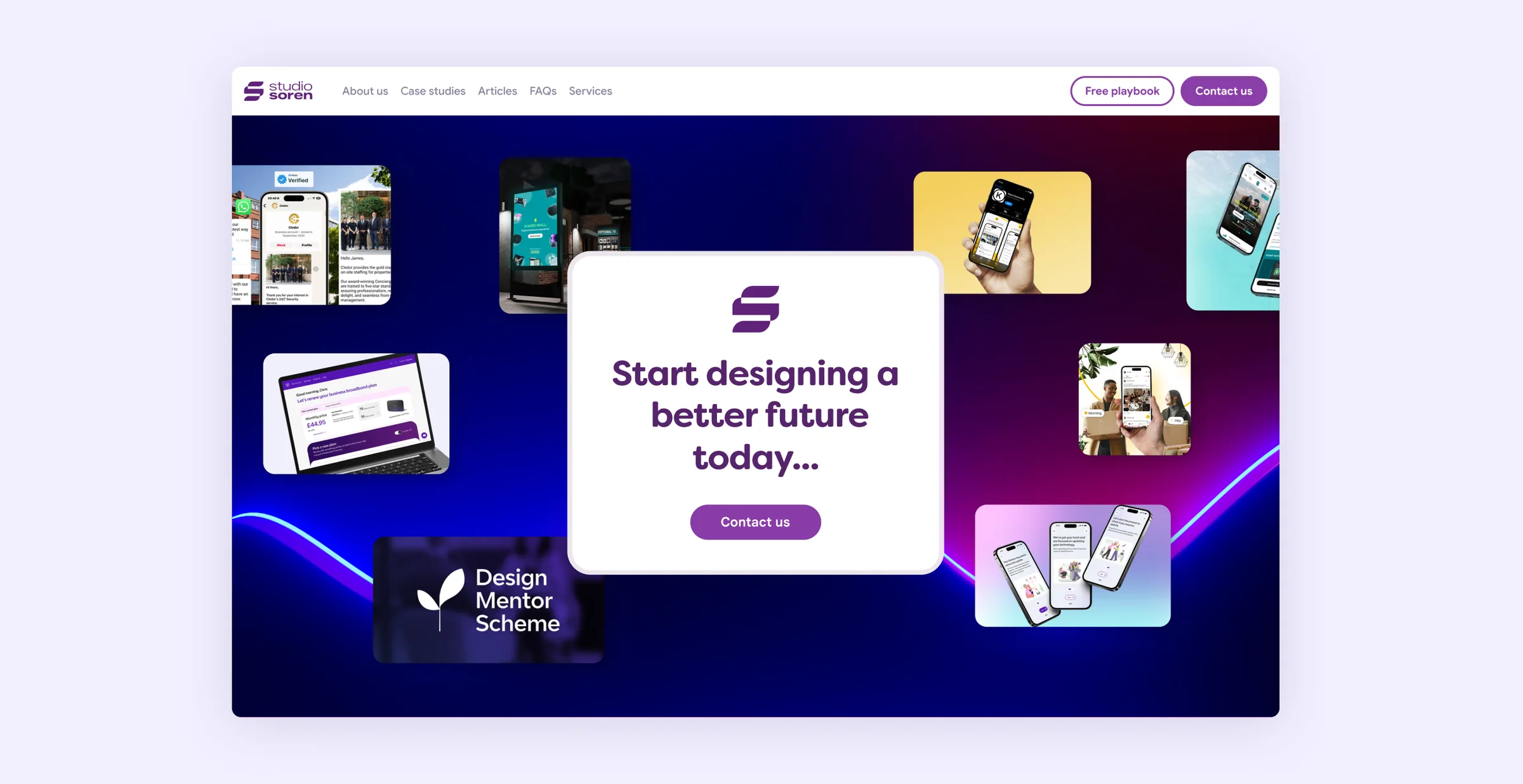
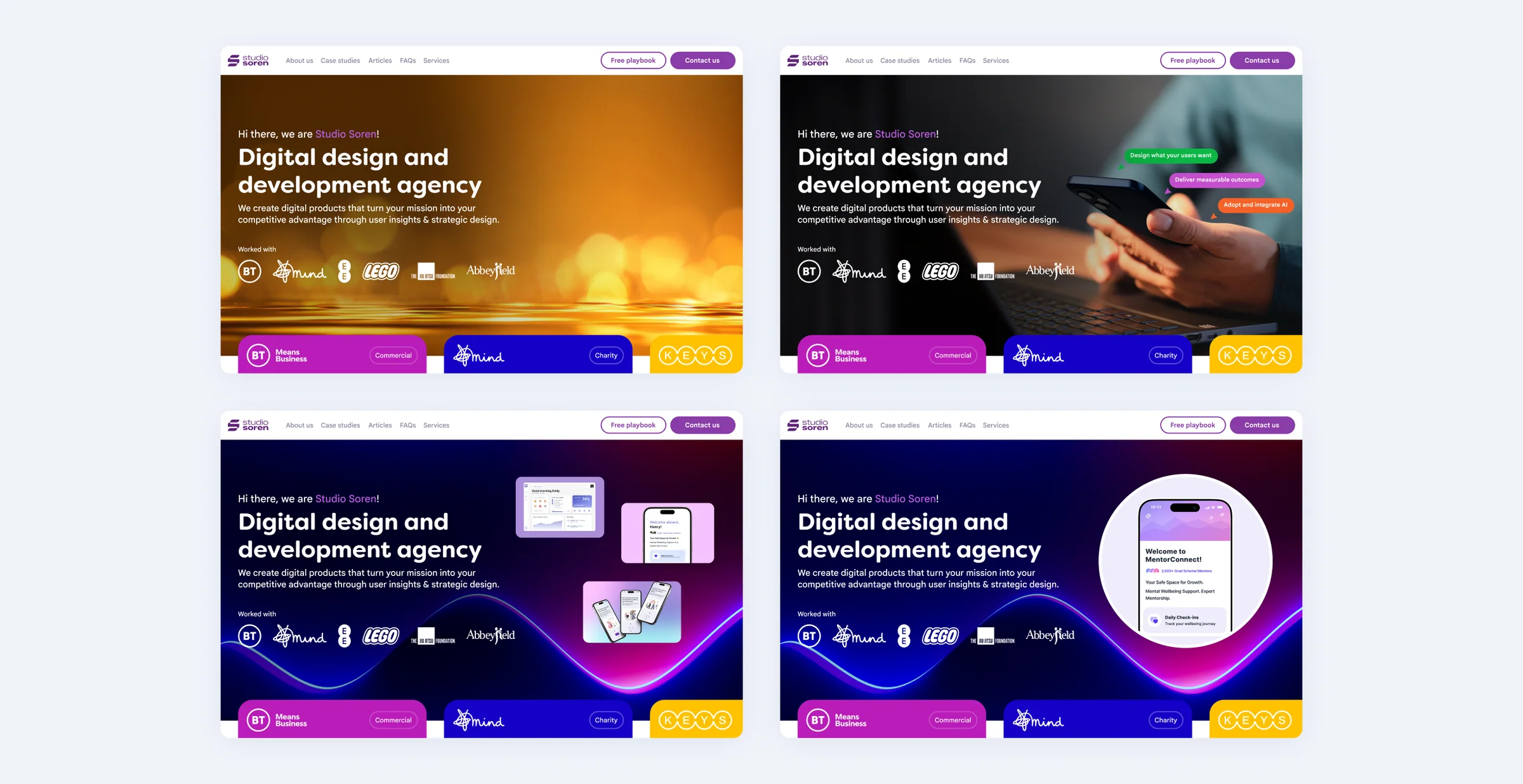
Because a significant proportion of visitors were leaving from the hero section, I revisited the messaging and visual hierarchy to better communicate the studio's value proposition immediately.
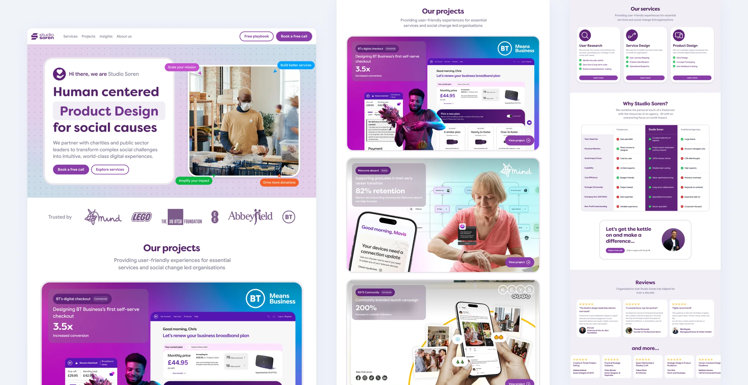
The final product
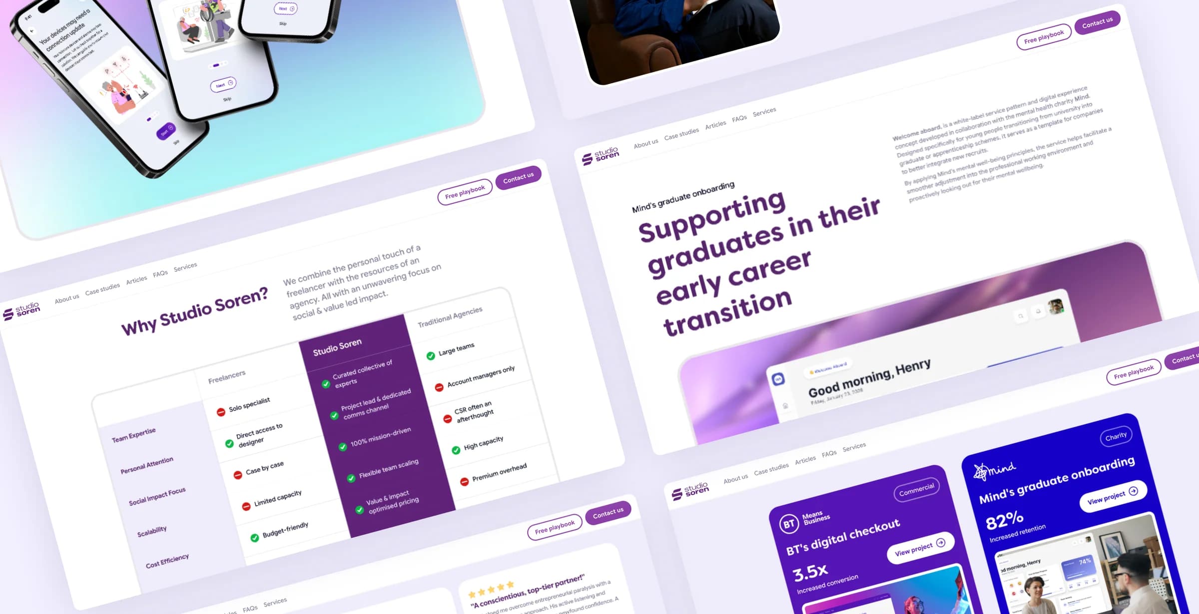
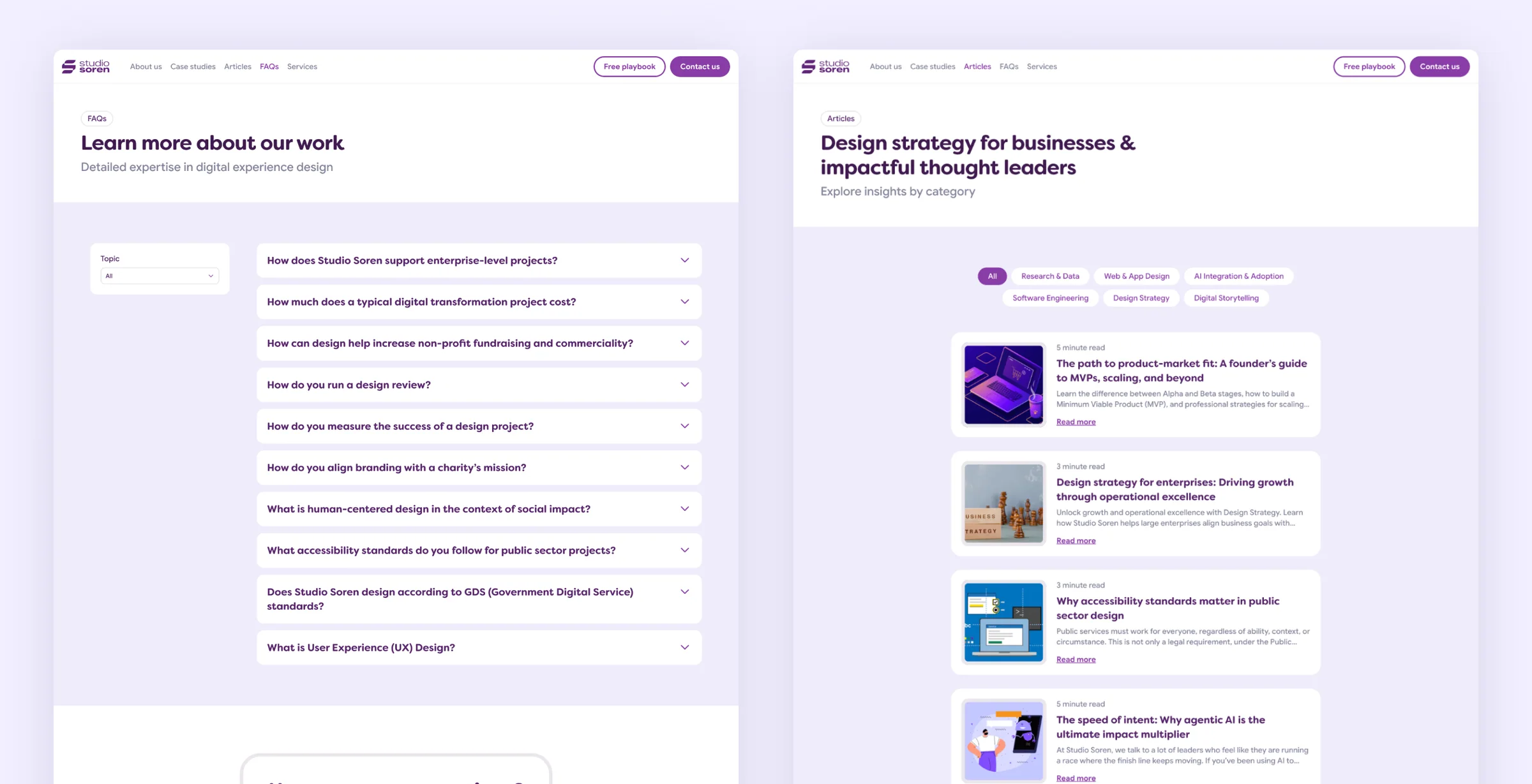
The final website combined a stronger visual identity with a more effective content hierarchy, shaped by both stakeholder input and real user behaviour.
The result was a more engaging experience that increased content consumption, strengthened trust, and generated new business opportunities.